
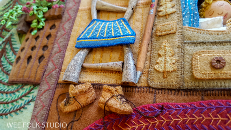
What is it about tiny shoes? There’s something irresistible about small scale footwear, whether it’s baby booties or doll shoes. Every time I post a photo with miniature shoes, there’s a huge response. So, I thought I’d share a selection of little slippers, boots and even high-heeled shoes I’ve made that range from precious to provocative (with a surprise guest near the end of the post).
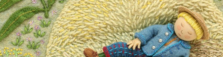
Many of the illustrations in my picture book, MY BED, show pairs of shoes that were put aside at bedtime, including the slippers above and the hiking boots below.

When making the Japanese interior scene for MY BED, I tried hard to convey a spare and ordered aesthetic, but couldn’t help myself from placing 2 pairs of slippers off to the side of the tatami mat. I thought that the shoes would break up the geometric blocks and give the space a lived in appearance. I’ve since learned that I don’t have a proper grasp of Japanese culture, because leaving one’s shoes out like that is a big no no! One follower pointed out that Japanese children would be spanked for being so careless. I was further corrected when the slippers were photoshopped out of the illustration in the Japanese edition of the book!

Early on, I made shoes out of old kid leather gloves that I painted brown, like the ones in this kitchen scene from Mary Had a Little Lamb. The kid leather was thin and pliable enough to cut with scissors and sew with a needle and thread.

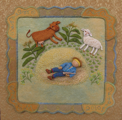
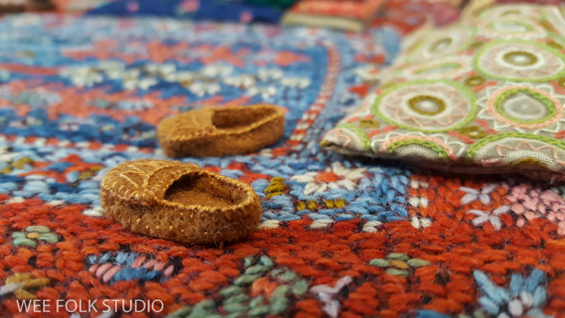
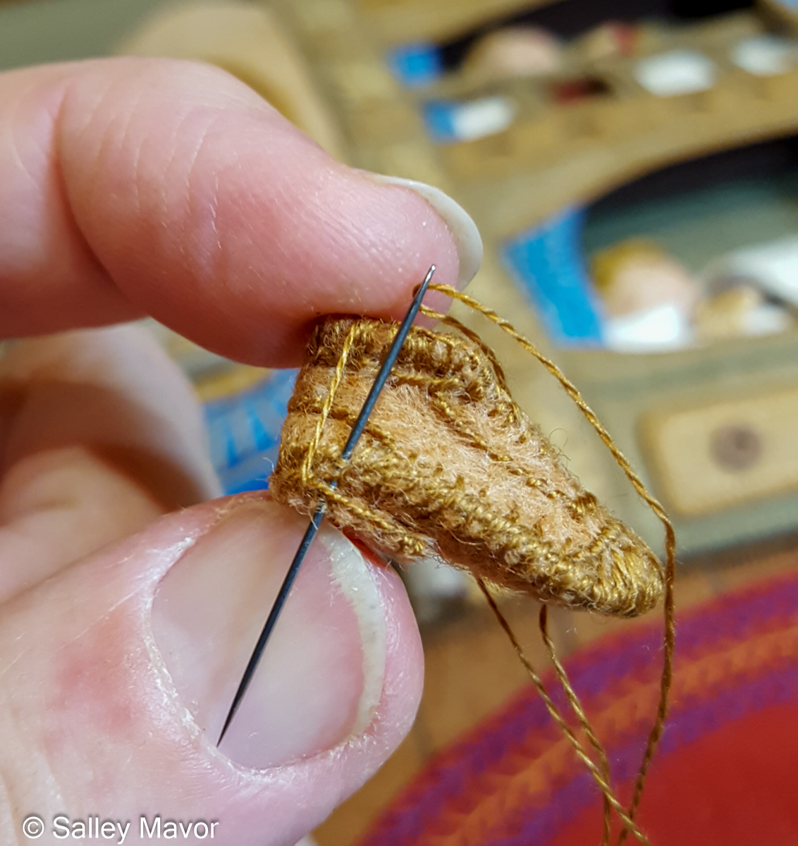
For the past 25 years or so, I’ve made shoes out of wool felt, which is much more forgiving than leather. For the rhyme, “Cobbler, cobbler, mend my shoe”, in Pocketful of Posies, I made felt boots, a leather work apron, and a wooden shoe sign, which I cut out with a jig saw.

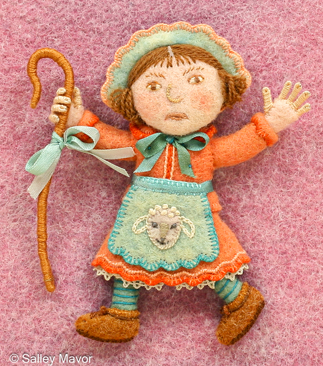
The different nursery rhyme characters in Pocketful of Posies wear over 100 shoes, in varying colors and sizes. There’s Little Bo Peep who lost her sheep…
the children playing Ring Around the Roses…

and the Crooked Man who walked a crooked mile in his hiking boots.

An old watch strap buckle came in handy for this shoe from “One, two, buckle my shoe”.

Does this shoe house look familiar? It was inspired by an LL Bean boot I found in the closet. Not only did the old woman who lived in a shoe have to feed all those children, she had to keep them all shod, too!


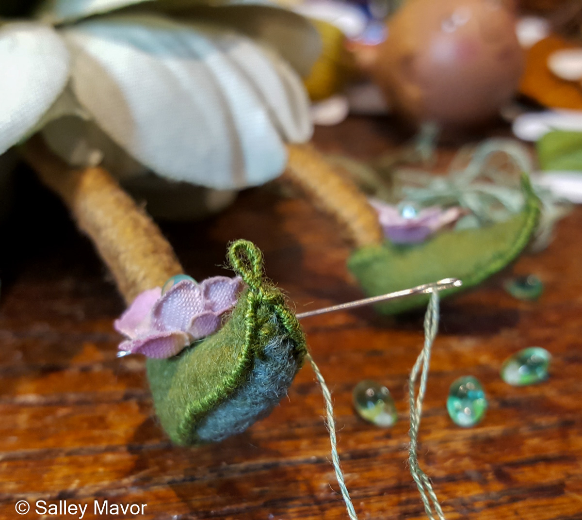
A few years ago, I made a pair of bigger than usual fairies to accommodate some large bur oak acorn caps from the Midwest. Because the Bur Oak fairies had nice big feet (1 1/4″), I could more easily cobble shoes for them. I made their slippers out of felt, with a bit of wire reinforcement to give them a pointy elfin look.

Most of the shoes I make are of the comfortable variety, but occasionally someone demands spike heels.
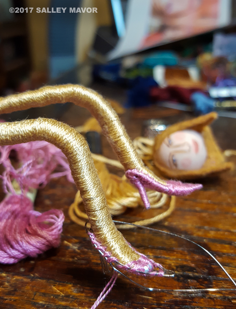
Like this pair of pink roach killers I made back in 2017, when Rob and I spent a year in the basement filming our stop-motion animation, Liberty and Justice: A Cautionary Tale in the Land of the Free. The film is just as relevant today as it was when it was released in 2018. In the photo below, the Melania character is getting a final fitting for her cameo appearance in the film.

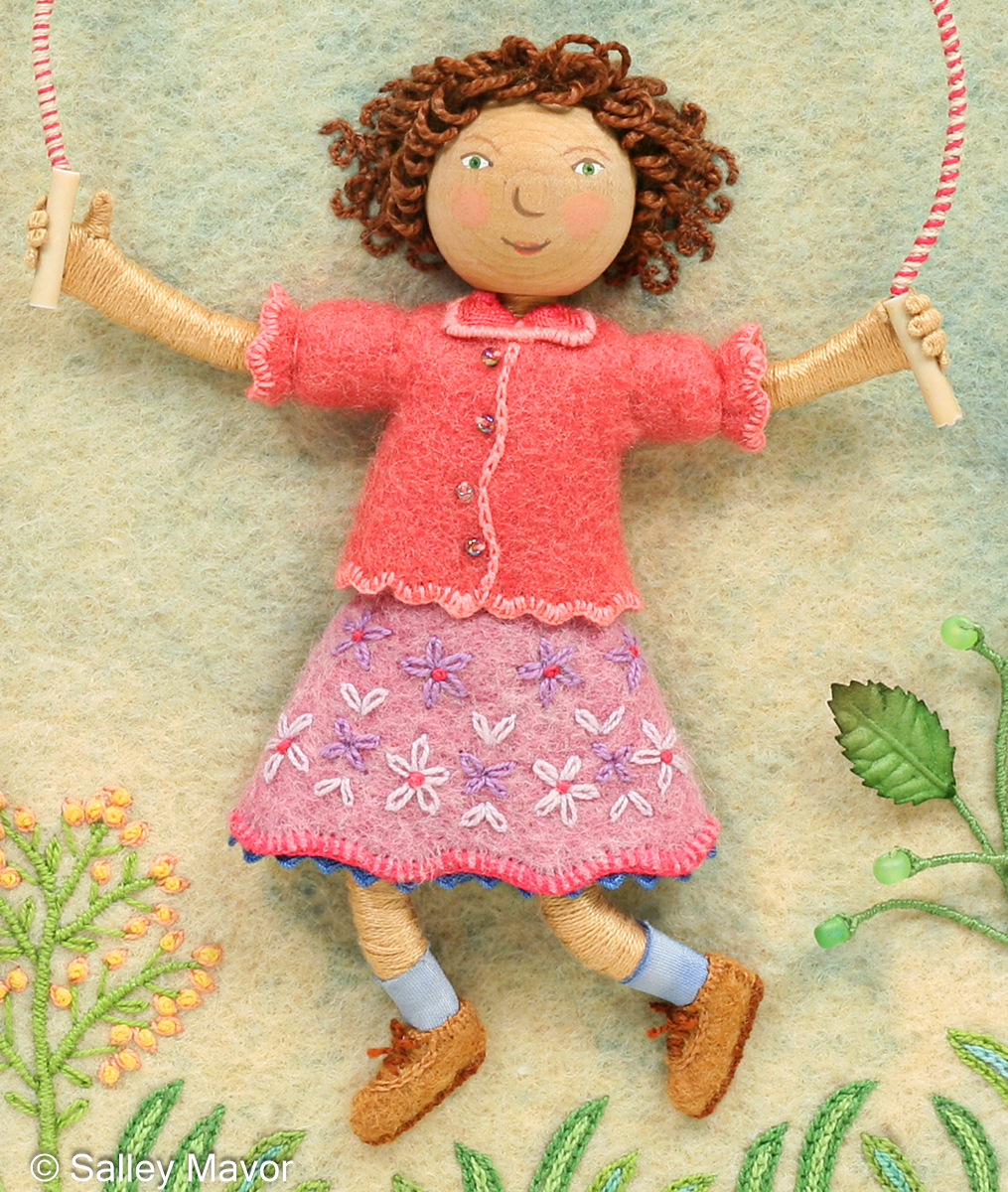
Let’s push aside all that glitz and glamor and finish up with “Jumping Joan”, who’s wearing a pair of sensible brown shoes, which everyone wore to school when I was growing up.
To keep up with new posts, please subscribe to this blog. Your contact info will not be sold or shared. If you’d like to see more frequent photos tracking the projects in my studio, please follow me on Facebook, Instagram and BlueSky.