
detail from “Pocketful of Posies”
When we first started talking about the front cover for Pocketful of Posies, the editors and I didn’t yet have a title. We were a few years into the project when one of the members of the production team suggested that I incorporate the title and byline into my artwork, thereby stitching the letters instead of dropping in the usual type set words. After going back and forth with title ideas for several months, someone from Houghton Mifflin came up with a name we all liked, Pocketful of Posies. We added the subtitle A Treasury of Nursery Rhymes to emphasize that this was a collection of rhymes, rather than a story book.

My first drawing for the cover had a circling group of characters from the book, echoing the ring around the rosies theme. I presented it to the powers that be and it and was asked to try again. No problem, I needed try something different. The design was too balanced and straight forward and, well, too boring and static for a cover, which should be dynamic. When it comes to sales, books are judged by their cover, especially picture books. People should feel the compulsion to open the book and look inside!

I decided to keep some of the characters, but had them doing different actions in a natural environment. I played around with angles and curves, adding large leaves to separate the sub-title and by line. I decided to enclose the action with a border and bendy, circular vines, which move your eye around inside the picture.

Some of the characters were removed in the process of translating this final sketch into the finished sewn illustration. I never know how things are going to turn out until I start cutting out shapes and constructing dolls. I made sure that both boys and girls were represented, as I didn’t want my sewn artwork to come across as too girly centric.

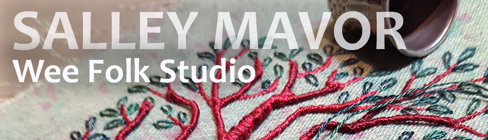
I wasn’t sure how I was going to make the letters, but I wanted to try something that had depth, so that the title would pop out. I figured that if it didn’t work, the graphic designers could always type set the words. I found some titles done in a nice flowing script in a book my mother had as a child, Chimney Corner Stories, by Lois Lenski. I liked the way the P looked, which featured prominently in my title, so I used this lettering as a guide.

from “Chimney Corner Stories” 1925
Using green cloth-wrapped florist wire, I wrote out the words by bending the wire to form the connecting letters. I then wrapped the wire by hand with 2 ply variegated embroidery floss. I don’t really remember how I finished off the ends, but probably made knots at the back (no glue). The picture below shows my first attempts at bending and wrapping. I had to try different ways of compressing the U and Y, so that the words could all fit on the leaves. I also changed the floss color to something lighter, so there would be more contrast with the green leaf background.

Besides the title, the cover illustration has a lot of other thread wrapped wire. The stems, vines and every leaf are edged with wire, making it possible to bend and shape the parts, tweaking until the last-minute, when the photograph is taken. See other posts with wire lettering here and here. I used red felt for the background, so that the green leaves and vines would stand out. Also, many of my recent books have had blue covers and I wanted something different.
Pocketful of Posies is sold in my Etsy Shop and includes a free bonus copy of my 2001 book In the Heart.

detail of “Pocketful of Posies” front cover

Wow, that is so beautiful. Thanks for sharing how you thought it through
this is beyond fun….perfect! thanks for sharing how the creative brain works!
It is reassuring to hear that someone as totally talented as you still has to redo things to please the publishing world. When people (who have never done something (they love) professionally) see your finished work, it is too easy to imagine you just do it once and it is accepted the way it is. No one, I guess, is exempt from tweaking things a bit. And, it was a great result. Thanks so much for sharing the “process” as it is so helpful to others to see and hear about it.
Thanks for sharing some of the process of your books…they are fantastic! I would love to be able to see some in person. Are you going to be near western North Carolina anytime?
Sorry, but I have no plans at this time to come your way. I have taught at the Campbell Folk School in the past-what a beautiful area!
Your cover is just stunning, with so many different textures, beautiful flow and charming colors. I am fascinated to read about your thought process in creating. It is so nice of you to share this with us. My friends call me “the Queen of Details”, so you can imagine how much I love seeing your work!!!! Thank you, Salley! Fantastic art!
So wonderful and whimsical! (Big Lois Lenski fan here.) Your letters are the perfect touch…you really found a creative way to enhance the needlework. I cannot wait until the work gets to CT so I can see it in person. Have to say that Humpty Dumpty is precious!
Hi Sally: thanks for sharing your work ideas and process. Just received your book and can’t wait to try my hand at it. Your wee folk are part of my imagination as a child and precious. Linda
Salley,
My son, husband, several friends and I had the extraordinary good fortune of seeing the exhibit at the Danforth Museum this afternoon. What an absolutely delightful exhibit it is! I have pored over the illustrations in the book, but it just isn’t the same as seeing the “real thing”. I was completely surprised and delighted by all of the metallic threads that you used. The wonderful light-catching and reflective properties of the metallics really made so many of the pieces pop. I’m so sorry that we could not come this evening. I would have loved to have met you. Hope you get lots of great feedback from the folks who are lucky enough to attend! Thanks again for the beautiful work you do and for sharing your processes here on your blog. One of my friends and I had quite a discussion today about whether you wrap your wire before or after you bend it into letters, so I was very happy to see today’s post! Best wishes to you!!
I love seeing a bit of the process of designing your pieces! This is amazing!
Always loved this book covers !!!
So wonderful to see all the steps in the design process 😉