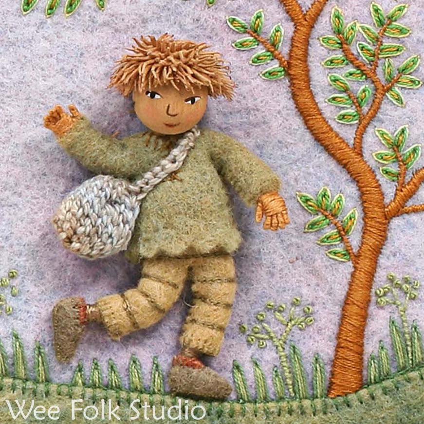
Illustration for Simple Simon from "Pocketful of Posies"
When I finished making all of the fabric relief illustrations for Pocketful of Posies, they were stitched onto foam core board. I added registration marks and then sent them to the photographer. Now that the book is being printed, I’m busy making the artwork presentable for their 2nd jig as framed pieces of art.

Each picture needs a different border to match. Strong, bright colors would compliment the illustration for the Simple Simon rhyme, with its fair booths. I made side and corner patterns and cut them out of felt.

I then blanket stitched around the outside edges of the felt pieces with some variegated thread. The Caron Collection has some great colors to choose from.

The inside of the border looked too abrupt, so I tried some rick rack along the edge, to soften the transition.

I chain stitched some loops, the date, and my initials in variegated embroidery floss. Since it’s hard to write on wool felt, I don’t use any guide lines for embroidery, but work free style. I decided to change the rick rack to a golden color, which set the border apart from the inside illustration. So, instead of softening the transition, I ended up giving it more definition.

There was space for a wider border, so I put some green open weave trim around the outside. I added some dark green bias tape underneath the trim, to give more contrast and show the holes.

There’s always a question of how busy a border should be and how many borders within borders to make, like ruffles on a skirt. It could go on and on and you could have a tiny image in the middle, with a huge border around it. Many quilts and fiber art seem to be made up of just borders, which is fine with me.


Note: See other posts from the Pocketful of Borders series here.
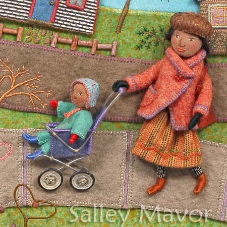
 Here’s a stroller from another page of You and Me with a baby that’s about 1″ long.
 This double stroller is being pushed by the old woman who lived in a shoe, from my book, Pocketful of Posies. The children are about 1 1/2″ tall.
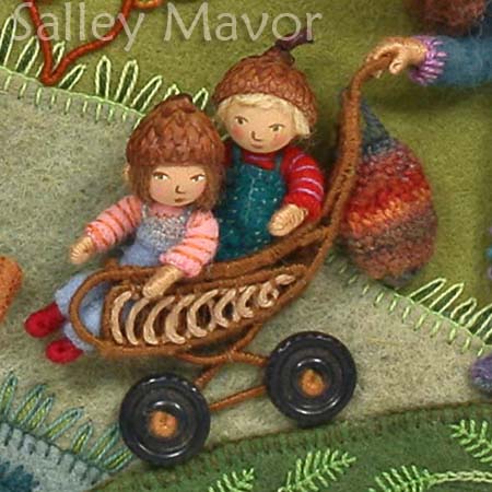 Note: See other posts in the Close-ups series archive here.