The Way Home (part 4)

 Continued from The Way Home (part 3)

I added the little bird character late in the design phase. Savi seemed so alone on the beach after her mother leaves, and I thought she needed an escort of sorts. Cecelia Yung, the art director, liked the addition and wrote, “About the bird: maybe he can be her “guardian angel”-someone who hovers protectively so that she’s never truly alone. He would be a comforting presence for the child who worries when Savi is alone in the dark. Maybe he can make his appearance when Savi’s mother leaves?”

sketches of birds for “The Way Home”


The Way Home, page 18

A few months before the artwork was due, I faced the inevitable and admitted that I would not be able to make the one year deadline. I called Cecilia and told her that I needed more time. She was understanding enough to extend the publication date another 6 months.

The Way Home, page 20

Through the fall and winter, I added the finishing touches, stitching blades of grass and hand sewing the floss edge around the border sections.

sketch of pages 16/17


The Way Home, pages 16/17

I was particularly fussy about the shadows, which were made up of different colored stitches. I kept thinking of something my teacher, Mahler Ryder had said years earlier at RISD, that shadows are not black, but are made up of colors.

The Way Home, pages 16/17 detail

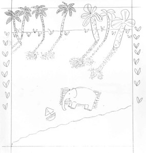
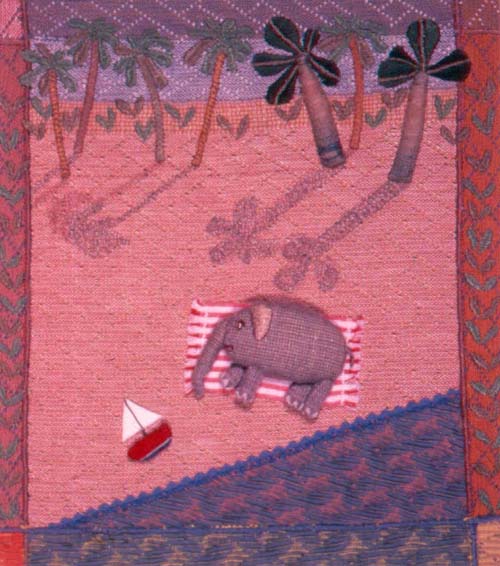
I was saving the book jacket illustration for last and imagined how it would look while I stitched the other pages. I took a mental inventory of what materials would be needed and was shocked to discover I’d forgotten about the sky fabric. I had used every last inch of Peter’s overalls on the inside artwork. I had none left for the cover illustration, the most important of all! This was a drawback of working with unconventional materials. If I worked in watercolor, this would never happen!

sketch of cover illustration for “The Way Home”

I had dealt with insufficient supplies before. I would have to find something similar, but the weave and shade were unique to an older line of Osh Gosh clothing. before I could work myself into a tizzy, the same fabric literally walked into view.

Molly’s pants back

My friend, Terry came over with her 2-year-old daughter, Molly, who was wearing a pair of jeans made out of the same light blue fabric! Terry is a seamstress and fabric lover, so she was not at all surprised when I asked her if I could have Molly’s pants when she outgrew them, which appeared to be imminent. I’ve kept the pants and when I hold them up at talks, they always get a reaction from both young and old audiences.

in my studio finishing the illustrations for “The Way Home”

The extra 6 months made it possible for me to finish by the new deadline in the spring of ’90. I packed up the illustrations and shipped them to New York. After the editors at MacMillan had a chance to look them over, Cecilia drove the artwork over to Gamma One in the city. Gamma One has a “painting with light” system that works well for textured work. During the minutes-long exposure time, light moves slowly back and forth, helping to define the dimensionality of the art. The 8 x 10 color transparencies were then color corrected to match my original art.

The Way Home, page 32

Cecilia suggested we put an explanation of my technique on the last page.

It reads,

“The original pictures for this book were made in fabric relief. This art form includes many techniques, including applique, embroidery, wrapping, dyeing, and soft sculpture. The background fabric was dyed and then sewed together. Three-dimensional pieces were made from a variety of materials, including covered and stuffed cardboard shapes, wrapped wire, found objects, and fabric. Details were embroidered onto the shapes and background and then the three-dimensional shapes were sewn into place. All stitching was done by hand.”

To be continued in The Way Home (part 5). 

To keep up with new posts, please subscribe to this blog. Your contact info will not be shared. If you’d like to see more frequent photos tracking the projects in my studio, please follow me on Facebook and/or Instagram.

The Way Home (part 3)

Continued from The Way Home (part 2)

About 6 months after our visit to New York, I received a telephone call from Phyllis Larkin at MacMillan. I remember being confused because her tone and inflection didn’t match the words she was saying. She was telling me in a slow, flat voice the most exciting news- that she would like to publish The Way Home!

National Geographic article on elephants

Of course, I could hardly believe it and when she asked how long I needed to sew the illustrations, I guessed “one year” on the spot, because I thought any longer might make her change her mind. Now that we had made it over the hurdle and sold our idea to a publisher, I needed to figure out how to bring all of the different elements of the story together in a series of pictures. Referring to National Geographic, I did sketches of elephants and noticed that African and Asian elephants have different shaped ears. When consulted, Judy thought that hers were Asian elephants.

sketches for “The Way Home”

In my imagination, I saw the drama of the story unfolding against the back drop of a landscape changing from day to night, like puppet show scenery, slowly scrolling from left to right.

editing the manuscript


Ian and his friend Sam in my studio, 1988

Judy edited the manuscript and I worked on the book whenever I could. The advance payment wasn’t enough to pay for daycare, so I figured out other ways to set aside time to work. I would spend a few hours stitching every evening, after the boys were read to and put to bed. During the day I was part of a coop arrangement, where I’d watch 2 other boys one morning a week and mine were taken care of 2 mornings. This picture shows Ian and his friend Sam in my studio wearing monster masks.

early sketch of Savi following banana trail

early drawing of Savi following banana trail

Somehow, I pieced together enough time to make progress and the pages started to take shape. In the beginning, I figured out what fabrics to use for the background, elephants and borders. I found a shirt of my husband’s to use for the elephant’s bodies. The gray Indian cotton was the perfect shade and texture.

Indian cotton shirt and dyed silk

I cut a piece of silk from my grandmother’s old nightgown to use for the water and then dyed it turquoise with a spray bottle. The silk was crumpled up when I sprayed the dye, so some areas were left white, making a foamy, wavy pattern.

The Way Home, page 4

I ripped out the seams of an old, faded pair of my son Peter’s overalls. There was exactly enough fabric to use for each section of sky. I dyed the light blue pieces sunset pink and then graduated shades of dark blue. For the night sky on the last pages, I used a midnight blue colored wool.

The Way Home, pages 26/27

The beach was made of a bumpy piece of raw silk, which I dyed green in the grassy areas. I redid the same scene that I’d made as a sample, matching the fabric with the other illustrations.

The Way Home, page 6

There were logistics to figure out, like how can an elephant carry a towel and toy boat, while leaving her trunk free to pick up bananas? I ended up tucking Savi’s boat into her folded towel, which she carried on her back. I also gave the mother a basket to carry bananas. Cecilia Yung, the art director and I corresponded about the book layout.

sketch for The Way Home pages 26/27

She sent detailed letters, going over every page. She pointed out things that I didn’t think about like allowing enough space for the dedication and copyright information. Her comments focused on making the elephants’ world consistent throughout the book. She reminded me to pay attention to the position of props like the boat and towel and keep the sun’s direction constant. She wrote, “Make sure shadows lengthen steadily in the same direction and of course colors should shift to reflect the sunset and night sky.

The Way Home, pages 22/23


The Way Home, page 14 sketch

There were so many details to consider for such a simple story! I thought about all the smart, observant children out there, who would see my mistakes and write the publisher with their corrections. Then I remembered that the book was aimed at preschoolers who can’t write yet. I then asked myself, “Don’t the littlest ones deserve the best quality books?” At the end of a letter, Cecilia wrote, ” We realize this is a tremendous amount of work for your first book, so do call if you have questions. We’ve very excited about The Way Home and will be glad to help.”

To be continued in The Way Home (part 4). 

sketch, The Way Home, page 28

To keep up with new posts, please subscribe to this blog. Your contact info will not be shared. If you’d like to see more frequent photos tracking the projects in my studio, please follow me on Facebook and/or Instagram.

The Way Home (part 2)

Continued from The Way Home (part 1)

After we moved, Judy and I kept in touch and would see each other when I visited Woods Hole every summer. Back in central Massachusetts, with my son in daycare part-time, I continued to sew pictures, developing my fabric relief technique. I tried out different ways of making people, animals and houses with flat cardboard backs that could be sewn onto a pieced and embellished fabric background. The raised figures and props seemed to work best at a shallow depth of 1/4″ to 3/4″. “Picking Peas” (1986) and “Raking Leaves” (1987) are examples of the change in my way of working.

“Picking Peas” fabric relief 1986

This was a very productive time for me. Even though I was busy taking care of a child, our life was simpler and less social because we hardly knew anyone in our new town.

“Raking Leaves” fabric relief 1987


Peter with our scarecrow in Lunenburg 1986

The area was beautiful, and my artwork was influenced by the agricultural landscape of our neighborhood. I started working in my studio in the evenings, a habit I’ve kept ever since.

In an effort to test the illustration market for my type of work, I made a solo trip to New York City, meeting with an agent and a few children’s book editors. The agent wasn’t interested in my type of art, but I recall that one editor was intrigued. She laughed good heartily when I laid out the fabric background for “Noah’s Ark” on her desk and arranged the loose animals in front of her. I realize now that this presentation must have appeared quite unprofessional compared to the ubiquitous black portfolio with plastic sleeves that most illustrators carry. After looking at my various pieces, she told me she liked my work but found it hard to match with a story. She suggested I find a story that I thought would work together with my style and technique.

I went home feeling that I wasn’t practiced enough to take the leap from depicting one moment in a story to filling a 32-page book with enough action and visual variety to make a story come alive. I needed more time to develop my work to a point where I could confidently take on a large illustration project.

Ian’s birth announcement


‘Noah’s Ark” fabric relief 1986

After our second son Ian was born, I kept working on fabric relief pictures. I remember finishing up the “Noah’s Ark” piece on my worktable, with him rocking next to me in a wind-up swing. You can see an earlier post with several pictures of “Noah’s Ark” here. I continued to make and sell fabric relief pictures, trying new ways of constructing 3-dimentional parts that could be sewn in place.

‘Family Portrait” fabric relief 1986


sketch for sample illustration

After four years away, we decided to move back to Woods Hole in the fall of 1987. Judy and I soon revived our interest in The Way Home and decided to start over and change our approach to the project. I felt more prepared to illustrate the story and with Judy’s encouragement, started to think how I would make a new sample to show. We wanted to impress the editors with our serious preparation, not wanting them to see us as two inexperienced housewives from Cape Cod. I made another illustration, this time picking a more active part of the story, where the mother elephant is enjoying herself on the beach, while Savi splashes in the water. I found some plastic banana beads that were the right size and cut banana tree leaves from cloth artificial leaves. Planning ahead for the border, I bought some diagonal striped upholstery fabric, in every color available.

 The text reads,

“Her mother cooled off in the shade of a banana tree and ate bananas. She rolled her big body from side to side in the sand. Savi stayed in the water.”

2nd sample illustration 1988

We knew that my new and untested method of working in 3-dimensions would be questioned as a viable illustration technique. We gathered everything that we could think of to counteract any skepticism. Since my originals would have to be photographed, we had a professional 4×5 transparency taken of my sample art. We also made a storyboard showing a simple layout in the standard 32-page format. It pictured the progression of the story with the different characters at the beach, in the water, walking through the trees’ shadows, following the banana trail and looking up at the moon at the end.

When we felt ready to present our project, we called and set up appointments with a handful of children’s book publishing houses in New York City. Judy was excited to be able to meet editors in person, because our visit would include showing my portfolio. Generally, writers are asked to submit their stories by mail only. My portfolio (brown leather, not black) held the original sample illustration for The Way Home, a color print and 4×5 transparency of the sample, the storyboard, plus a collection of 8×10 color prints of my fabric relief work from the past 4 years.

Judy and I drove to western Connecticut, where we stayed overnight with friends. The next morning we took the train to New York. We spent the entire day visiting children’s book editors, the most memorable being with Phyllis Larkin, an older, respected editor at MacMillan. When we were introduced and I saw her face, I knew that we had met before. I forget names, but faces make their imprint. I remembered that she was the one to whom I had shown the Noah’s Ark parts a few years earlier. Phyllis behaved as a true editor, asking to read the manuscript first before looking at my portfolio. She carefully read the story and then called in her art editor, Cecilia Yung. We laid out our visual materials and held the 4×5 transparency up to the light. They liked the pairing of Judy’s story with my artwork but had financial concerns about the extra expense of photography. They were also upfront about their inability to offer me an advance large enough to pay for the time it would take to sew the illustrations. We left them a photograph of the sample art and a copy of the manuscript and went home. We were encouraged because they liked our idea, but didn’t know if they would take the leap to offer us a contract. Months went by and we didn’t hear from any of the editors we’d met with. Judy and I put the project in the back of our minds and were fully distracted by summer activities.

To be continued in The Way Home (part 3).

Summer in Woods Hole, 1988

To keep up with new posts, please subscribe to this blog. Your contact info will not be shared. If you’d like to see more frequent photos tracking the projects in my studio, please follow me on Facebook and/or Instagram.

The Way Home (part 1)

This is the story of the making The Way Home, my first picture book for children. In the 5-part series, I explain how the writer, Judy Richardson and I persisted over a period of 8 years, from our first glimmer of an idea in 1983, to having Judy’s story and my illustrations paired together in a book published by MacMillan in 1991.  This is not meant to be a guide for those who want to have their own work published. Our unique project and the time and circumstances in which we were working shaped the trajectory of events I will be sharing. There’s a lot to show and tell about this story and I hope that you will follow through until the end of part 5.

The Way Home, published in 1991

I majored in illustration in art school, but I never thought I’d make illustrations in a way that could be reproduced effectively. At the Rhode Island School of Design during the 1970’s, there wasn’t an obvious major for someone like me, who was interested in many different materials and methods.  I didn’t want to limit myself to a particular discipline and was attracted to the illustration department, with its focus on communication, rather than certain processes and mediums. Just as other schools are divided by subject, our student body was separated by technique, and I regret not mingling with people in other majors. Other possible matches, like the sculpture or textile dept. were too specialized for me.

Salley at RISD

The sculpture dept. seemed to me like an all-boys club, with its swarm of black clad, chain-smoking, wiry young men who produced large, austere metal sculptures, the kind that are now rusting in public places. Even the more female dominated textile dept., with its concentration on fabric design and weaving, was too specific for me. All I knew was that total abstraction left me hungry for more and I wanted my artwork to be a kind of narrative that viewers could connect to. In the illustration dept., I could use any materials I wanted, as long as my artwork solved the assignment. I used this time in school to teach myself different ways of working and showed a particular interest in fabric and sewing. For my senior thesis, I made a series of 3-dimentional illustrations of the story “Hansel and Gretel”.

“Hansel & Gretel” RISD senior thesis 1978
illustration from Houghton Mifflin educational reader, 1979

Following graduation in 1978, I spent a few years making soft sculpture. My first freelance illustration job was constructing insect characters and their neighborhood for a story in an educational reader. I found that making all of the parts was easy compared to setting up the scenes for the photo shoot. It was almost like making a movie in miniature, complete with an “Ivory Snow” winter scene. The project was challenging, and I came away thinking that I would have more control of the outcome if I figured out a way to present my sculpture in a different format.

illustration from Houghton Mifflin educational reader, 1979

I started making what I called “fabric relief” sculptures, which were figures and props sewn to cloth backgrounds. I guessed that if my work was hung on the wall, it would be more readily accepted as “art”. I also thought that bas-relief work would be easier to photograph than sculpture in the round. “Mother and Child” was an early fabric relief sculpture that I made with fabric-covered and stuffed cardboard shapes on a pieced and embroidered fabric background.

“Mother and Child”, fabric relief 1983

Molly Bang, an illustrator who lives in Woods Hole, showed me Judith Benet Richardson’s 2-page manuscript for a picture book titled The Way Home. Molly had recently illustrated Judy’s novel for young readers, David’s Landing, which takes place in a village very much like Woods Hole, named Maushope’s Landing. Molly’s cover illustration shows a drawing of the Woods Hole School (built in 1870), where I attended elementary school in the 1960’s.

Her 1981 wordless picture book, The Grey Lady and the Strawberry Snatcher, had won recognition as a Caldecott Honor Book and she was nice enough to show an interest in Judy’s writing and my artwork. I liked The Way Home immediately and could envision the baby elephant and her mother at the beach. Today, 27 years later, I marvel at how very fortunate I was to have this story presented to me. As an illustrator who is not a children’s writer, I have learned to appreciate how difficult it is to craft a good story that children will want read to them over and over. Like poetry, everything about it has to work, the characters, the place and the rhythm, without any unnecessary words. Judy’s story had believable and charming characters, a strong sense of place, tension and a problem resolved in the end.

Molly Bang’s ‘Grey Lady and the Strawberry Snatcher” 1981
sketch of sample illustration

We decided to work together, and I made a sample illustration of Savi, the baby elephant, alone on the beach, with the banana trees casting long shadows. I knew that an editor would want to see just a sample of my work, not the complete set of illustrations. Picking a book size and designing the page layout comes later, after a contract is signed.

This part of the story reads:

“The sun went down a little farther. Savi came out of the water and lay on her towel. She began to feel cold and hungry.”

Sample illustration made in 1983

Judy and I sent out the story and photographs of my sample illustration to a handful of editors, none of whom were interested. Looking at it now, I can see that showing this part of the story was not a good choice for a sample. The artwork and the moment it illustrates were too static and not the obvious scene to pair up with the story. It was the most lonesome point, just after a tense moment when Savi’s mother leaves her because she refuses to get out of the water.  I can see why I was drawn to this emotional part, but visually it was too motionless. To sell our idea, we needed to show a more active scene, one that more accurately represented the story as a whole.

detail from “Self Portrait: A Personal History of Fashion”

That summer our book project was sidetracked by the birth of my first son, Peter. You can see more pictures of my Self Portrait in an earlier post here. Soon after, I moved away with my family to Central Massachusetts. My sample illustration for The Way Home sat in a box, while I adjusted to motherhood and living in a new town.

This story is continued in The Way Home (part 2).

To keep up with new posts, please subscribe to this blog. Your contact info will not be shared. If you’d like to see more frequent photos tracking the projects in my studio, please follow me on Blue SkyFacebook and Instagram.

Costume Party!

This story was first posted on Beth Curtin’s wonderful blog, Acorn Pies. She has some great project ideas for children. Beth asked me to be a guest contributor and write something on the subject of encouraging creativity in children. I decided to focus on play acting as a way for children to use their imaginations. Here, I share some memories and photographs of my sons’ pirate-themed birthday parties. Thank you, Beth, for the invitation to talk about children and creativity!

When I was a child in the 1950’s, we had a wooden chest full of “dress-ups” that included old clothes and costumes that my mother made. I remember different colored Snow White dresses that she made from this McCall’s pattern.


I continued this tradition with my own children and our dress-up box was a hit when friends came over to play. We had an eclectic pile of capes, belts, scarves and head-gear that would go together in any number of combinations. The children would spend a long time adorning themselves and then run around playing inside and out. When they were three years old, my son Ian and his friend Sam made monster masks. They would pull them down over their angelic faces, scream and growl, and then lift them up and laugh.

For the boys’ birthdays, we had our share of bowling parties and trips to the go-cart track, but the most memorable birthdays were the themed parties that were linked to a familiar story. In the late 80’s, we had several costume parties when the boys were ages 5 to 8, when kids are willing to dress up and engage in fantasy play.

Legendary characters, like Pirates were the inspiration for our parties. The stories surrounding these compelling characters could easily be translated into party activities and their exciting outlaw image was an added attraction. The boys would draw and write out their own invitations, asking their friends to come in costume.

It is advantageous to have a warm weather birthday for these parties, although we did have a Pirate party in February, complete with a make-shift pirate ship in the yard. We devised a raised, plywood floor, propped up on tree logs and added a boarding ramp. All it needed was a mast to fly a pirate flag.

For another pirate party, this time in July, the children came ready to participate.


Here they are, waiting for the pirate ship, with their cardboard telescopes.

They arrived at the island, where a bottle washed up into the shallow water off the beach and inside was a treasure map!

They followed the clues on the map and found the treasure chest full of goodies, including water pistols.

Looking back at the pictures, the life of our children looks so much simpler and not as commercial as today. We did work hard to keep our home life uncomplicated and creative. I’m sure that my mother would say the same thing about my childhood 30 years earlier. Young children are developing their imaginations and we as a society need to nurture this, but at the same time be aware of how impressionable they are. I think that being exposed to the same commercial images over and over, no matter how compelling or beautiful, stops children from seeing in their mind’s eye what something or someone looks and acts like. Even the McCall costume pattern, which was copyrighted 1938 by Disney, shows a clear connection to the animated movie that we have come to think of as the classic rendition of Snow White and the Seven Dwarves, even though the story is centuries old. As for pirates, the brilliant Johnny Depp has forever imprinted his depiction in our minds. I’m not sure how to keep a child’s imagination alive, but I think that giving them an opportunity to create characters of their own, whether through art or play acting can make a difference for some and help them imagine new possibilities in the future.

In an earlier post, I’ve shared pictures of our Robinhood Party, here.

Pins (part 2)

Continued from Pins (part 1).

I started adding new designs and soon had 20 different pins.  It was time to be more serious about marketing and I decided that a catalog was needed to reach more people. A former classmate from RISD, Niki Bonnett, volunteered to develop some promotional materials for my business.

Pin catalog designed by Niki Bonnett, 1980

Niki devised a poster that could be cut up in strips and glued together in such a way as to make an accordion-fold catalog. She made drawings, with descriptive hand written notes identifying materials and features of each pin.  For the sake of economy, the poster was printed in black and white, and I hand colored the pin illustrations with markers. I constructed a cover for each catalog out of cloth-covered cardboard. Then I glued the beginning and end of the accordion folded pages to the inside of the front and back covers, along with ribbon ties. The finished catalog size was 4″ x 3″.

pin poster designed by Niki Bonnett,1980

In a recent conversation from her home in Ashville, NC, Niki remembers this about the project: “When I did your job, I was working at Hill, Holliday, Connors, Cosmopulos (HHCC), a well-known ad agency in Boston. I was doing freelance work at night to build my portfolio and I loved your pins. For your project, I designed a poster with all the art and type as white on a black background. Once printed, it could be cut up into horizontal strips that were then hand colored, accordion folded, taped together and hand-bound into a fabric wrapped cover (also handmade) that tied shut with a bit of ribbon. Obviously, back then I didn’t think about my time as part of the cost of doing the project, and I had plenty of it back then too! All it cost was the printing of some black and white posters! Those posters looked great on their own, and it was lots of fun making those books; they were little gems.

In addition to the design and production of the piece, I also did all the illustrations of the pins, the calligraphy naming each pin style. I got one of the typesetter reps who visited HHCC every day to give me an entire alphabet of uppercase, metal letters (“slugs”? I forget the terminology for those bits of lead type). The letters were tiny, maybe 12 point. I used a brayer to roll black acrylic paint out on a piece of glass and then hand printed each tiny letter on rough newsprint until I got the “perfect” letter. Once I chose the letters for the entire alphabet, I blew them up to four times the original size on the Photostat machine (Good thing I had a key to that ad agency! Can you imagine being able to sneak back into a large office now to work on your own stuff from 8 to midnight?). That became my typeface from which I made all the “typeset” words. Needless to say, there was A WHOLE LOT of cutting and pasting goin’ on!

House Pin 1977

I was very proud of that project and I know I still have at least one of those books and some pins tucked away somewhere all these years later. I sure do miss the hands-on way design was done before computers; that’s what eventually caused me to quit my graphic design business in favor of making art quilts. I never made the kind of money I made in commercial art with my textile artwork, but it was so enjoyable… the creativity and the “making” of things!”

Salley arranging pins on top of poster, designed by Niki Bonnett, 1980
Mummy pin
Eggplant Pin 1977

My pins were included in Yankee’s Feb. 1981 issue, along with articles about a man who played music on a saw and someone who repaired oriental rugs. Laura Gross wrote, “Sparkling beads and soft velvet compliment her intricate hand-sewn and embroidered Egyptian mummies, palm trees, hearts, carrots, etc. Prices range from $4.00 to $12.00, and her custom work starts at $15.00. In the past, Salley has specially made banjos, cats, mermaids, New York town houses, corn-on-the-cob and a doctor’s bag, complete with gold initials.” I don’t recall making the doctor’s bag, but I do remember sewing on individual yellow seed beads for kernels of corn.

pin catalogs, 1980

People wrote in response to the article and I sent out free catalogs in manila envelopes. I can’t remember how many orders came in, but it was enough to keep me busy for a while.

Pin catalog

The story will be continued in PINS (part 3).

To keep up with new posts, please subscribe to this blog. Your contact info will not be sold or shared. If you’d like to see more frequent photos tracking the projects in my studio, please follow me on Facebook and/or Instagram.


Mum’s Knitted Hats

For as long as I can remember, my mother, Mary Mavor, was always knitting. In her lifetime she produced hundreds of hats, sweaters and blankets, offering them like warm hugs to her friends and family. She was most prolific with the hats, which had side flaps and a pompom on top. She started making them in the 50’s, when we were kids. The hats were not just for children, but for her adult friends, too. She’d find out what colors they liked and measure their heads, frequently testing the hat size half way through the knitting process. Just yesterday, I saw one of my mother’s good friends walking up Water St. in Woods Hole, wearing one of her hats. It’s such a cheerful reminder of her spirit.

My sons Peter and Ian in their grandmother’s hats, 1989
my son Peter in 1984, machine applique by Salley
Mum knitting, with Dad on the right, 1951

My sister, Anne Mavor, wrote a piece about our mother and her knitted hats for Interweave Knits Magazine’s Holiday issue in 2006.

Anne’s article in Interweave Knits Magazine, Holiday 2006

Here’s a sample from the article:

“Even though Mum never taught me how to knit this hat, I watched her knit hundreds of them. I know the click of the small double-pointed needles as she followed the pattern round and round. I know the curve of her hands as they lifted up a strand of blue yarn, wound it around the needle and then picked up the white. I can close my eyes and still see her hands moving, reading glasses balanced on the end of her nose, tongue working in her cheek.”

Anne with her husband Dennis and their son Rowan, 1990
Anne and Mum in 1952

Anne describes how after our mother died, she found Mum’s zipped knitting needle pouch and decides to learn how to knit the same hat with no pattern, just a sample hat to work from. She eventually figures out how to knit the hat and writes directions, which are included with the article.

She writes this at the end:

“The night before Mum died, I sat beside her bed listening to her labored breathing. She and I were suddenly not mother and daughter anymore. We were two women sitting in a nursing home bed-room, one dying, the other living for a while more. Two lives with intersecting circles that included a pouch of knitting needles and a particular three-colored hat with earflaps.”

To keep up with new posts, please subscribe to this blog. Your contact info will not be sold or shared. If you’d like to see more frequent photos tracking the projects in my studio, please follow me on Facebook and/or Instagram.

Snowy Monday

We drove around town this morning, marveling at the snowy scenery, which made everything look like a Christmas card. Here are some photos of Falmouth and Woods Hole.

Falmouth Historical Society

Nobska Lighthouse, Woods Hole

Nobska Beach, Woods Hole

house on Falmouth Village Green

Crowell House, Woods Hole

bed & breakfast, Falmouth

Woods Hole Village Quilt

A few years ago, my friend Terry McKee and I designed and organized the making of a community quilt for the Woods Hole Public Library.

Center square of the Woods Hole Quilt

We asked local quilters to make squares depicting buildings and scenes from our Cape Cod village. I was honored to make the center square of the library, a familiar sight with a distinctive round stone exterior.  My family has lived here since the 1920’s when my scientist grandfather, James Mavor Sr., came to set up a lab at the Marine Biological Laboratory. As a child in the 60’s, I remember walking with my class the short distance to the library from the Woods Hole School (one of the quilt squares).  Today, the library is still a central part our community, one that reflects the unique charm and character of our village.

Woods Hole Public Library

In the process of making the library square, I found some stone wall fabric that looked remarkably like the building. I decided to liven up the scene with appliqued bushes and vines made with batik fabrics.  About twenty women worked on the quilt in 2006 and 2007, and it was hung in the Library stairwell in early 2008. Come and see our beautiful quilt! For those of you who travel on the ferry to Martha’s Vineyard, the library is just up the hill from the dock.

Detail of quilt center square
Stitching rope letters to the banner

The Woods Hole Community Quilt is now featured in a 2010 Calendar, which was made to celebrate the centennial year of the Woods Hole Public Library.

Terry McKee (left) and Salley Mavor with the framed Woods Hole Quilt

To keep up with new posts, please subscribe to this blog. Your contact info will not be sold or shared. If you’d like to see more frequent photos tracking the projects in my studio, please follow me on Facebook, Instagram and BlueSky.

Joining the Blogging world! Selfportrait

detail from Self Portrait : A Personal History of Fashion 2007

This blog is an opportunity to share my creative life with you, whether you’ve seen my illustrations in children’s books, have made projects from my how-to book, Felt Wee Folk, or are a lover of embroidery and textile art.  I will share pictures of my studio and work in progress, along with images and artists that I find inspirational. After years of quietly working in my own private space, I feel compelled to communicate with like-minded people, who have a passion for stitching.  I plan to present current work as well as dip into the past, showing early works made during my 40 year career.  It may take a while for me to become comfortable sharing my ideas and reflections in writing, as I am more content  to make and show than explain in words. So, rest assured that I will be posting lots of images!

Self Portrait: a personal history of fashion, 2007

I made this piece for a self-portrait invitational show in 2007. It shows a spiral of dolls, one for each year, starting with my birth date in the center. Each figure is dressed in an outfit I would have worn that year, taken from memories, family photos or imagination. The dolls are a variation of the wee folk and fairies in my how-to book, Felt Wee Folk.

Self-Portrait detail

I made many of my original dresses and recreated them here with smaller scale fabric and embroidered wool felt. My husband, Rob, appears the year we were married and my sons, Peter and Ian, are included through the years when they were little and physically connected to me. The tatting around the outside of the circle was made by my late grandmother, Louise Salley Hartwell. The wool felt spiral is mounted on upholstery fabric, which I embellished with multicolored french knots.

When the piece is not  included in one of my exhibitions, it is on semi-permanent display at the Woods Hole Public Library, Woods Hole, MA. My husband Rob and I made the following film set to music I remember hearing through the years.

Self-Portrait detail

Posters and cards are available in my Etsy Shop here.

Poster – Self Portrait

To keep up with new posts, subscribe to this blog (top right column on the home page). Your contact info will not be shared. If you’d like to see more frequent photos tracking the projects in my studio, please follow me on Facebook and/or Instagram.