At 26″ x 30″, Noah’s Ark is the largest piece I’ve ever made. Everyone has their own scale and mine tends to be small. Even if the outside dimensions of a piece are large, I will fill it with smaller items. Looking at this picture now, I see large areas that would not escape my present-day appetite for embellishment. It’s tricky to keep the all over design working, so that it draws you in first and then you can appreciate the detail up close. At this time, in 1985, I had stopped making the pins, but was still designing small animals of the same size to use in my fabric relief pictures. You can read a 3 part story about my pins in earlier blog posts here. Showing the story of Noah was an opportunity to continue figuring out how to make a variety of animals. It was also a way to play around with arranging them together in a landscape.
“Noah’s Ark”, 26″ x 30″, fabric relief 1985
The background fabric is cotton velveteen, which I dyed with a spray bottle, building up layers of color, giving it a variegated, stippled appearance. The border is made from an upholstery fabric remnant that I remember finding in a bargain bin at a fabric store in Berkeley, California.
dyed velveteen
Detail of "Noah's Ark", 9" x 12", 1985
sketch of Noah's Ark
During this time, I was hand embroidering the leaves on the trees and adding some leaf beads as well. The fabric is machine appliqued, something I would give up shortly after this in favor of hand stitching. I came to dislike the uniform, flat stitches and put my sewing machine away for years at a time. It’s fun to look at this piece and see early examples of human figures and animals that I will continue to rework and develop for another 25 years.
This might look like something a child would do, but I painted “The Laplander” while a 21-year-old art student at RISD. My illustration teacher, Judy-Sue Goodwin-Sturges, gave me a roll of brown paper and told me to work big. She could see that I was struggling to find my way artistically and this was her way of getting me to see other possibilities.
The Laplander, tempera and pastel, 1977
The assignment was to illustrate a story about a Laplander. So, I bought some tempera paint, wide brushes and some children’s pastels and taped the 6 ft. long sheet of paper to my apartment wall. I can remember how exhilarating it was to move the wide brush across the paper. It felt as loose and playful as a finger trail on a foggy car window. As part of the excercise, I tried not to think too hard or overwork the painting.
detail of "The Laplander", 1977
When I brought the rolled up painting to class and hung it up with the other student’s work, it was by far the largest piece and was highly visible from across the room. During the critique, another teacher walked past the open doorway and poked his head in. He pointed to my picture and called out, “What is that?” I don’t remember if anyone responded to him, but he soon walked away. Now I must tell you that every art school student has bad critique experiences, but this was very unusual behavior for a teacher who has no connection to the class. This man, whom I shall not name, no longer teaches and has gone on to become a very famous illustrator. I can remember being shocked at his rudeness, but also felt excitement because he noticed my work. You see, I had previously decided not to register for his class because my friends had complained that his class was torturous unless you were willing to draw in his style. I’ve never spoken to him about the incident and for years held a grudge against him. It wasn’t until I saw him 20 years later at an art show that I experienced his human frailty, that I could see him for what he was, just an insecure man who is vulnerable like everyone else.
I’ve kept The Laplander painting for 30 years and recently unrolled it, ironed out as many wrinkles as possible and photographed it outside. Seeing it today reminds me of a time when I was unsure about how to make my mark and how, with the help of an insightful teacher, pressed forward into unknown territory. There have been other moments of uncertainty, but I continue to strive for qualities like sincerity, strength and vulnerability in my art and in my life.
"The Laplander" with Salley today
My teacher, Judy-Sue Goodwin-Sturges still teaches at RISD and encourages students to develop their own individual styles and find new ways to extend themselves artistically. Thanks, Judy-Sue, for helping me find new possibilities, then and now! Here she is in the early 90’s with some of her former students who are children’s book illustrators, Salley, Ashley Wolff and Holly Berry.
My niece, Danya, looked through her grandmother’s portfolio from RISD and really liked this drawing of three fish in a circle. It’s dated Feb. 4, 1944, so my mother was 19 years old when she drew it, the same age her granddaughter was when she chose it as the inspiration for her tattoo.
drawing by Mary Hartwell (Mavor), 1944
Mary and her mother, Louise Hartwell, 1944
Danya is my brother Jim’s daughter, the youngest and only girl out of 5 grandchildren. She worked for me for a few summers, putting kits together when I still made them at Wee Folk Studio. She is now a sophomore in college, where she is discovering art history. For her tattoo, Danya traced one of the fish from the drawing and made a black ink copy complete with bubbles. She brought it with her to the tattoo parlor and had the fish tattooed to the inside of her right arm. Now, she has a constant reminder of her grandmother, whom I think would be quite amused at the idea.
This selection of hearts begins with a sleeping cat on a heart covered bed spread from my book In the Heart. Then there is a felt balsam pillow and a heart pin covered in french knots, both projects from my how-to book, Felt Wee Folk. The last two are a chain stitched heart that’s part of the endpapers and a heart tart from “The Queen of Hearts” nursery rhyme (see in this post) from my upcoming book, Pocketful of Posies (Sept. 2010). The original illustrations will be shown in a traveling exhibition which you can find out about here.
detail from “In the Heart” 2001
balsam pillow from “Felt Wee Folk” 2003
pin from “Felt Wee Folk”
detail from “Pocketful of Posies” 2010
detail from “Pocketful of Posies” 2010
Note: See other posts in the Close-ups series archive here.
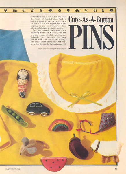
In an effort to meet people and to make more for my labor, I became a member of the Christmas Store, a seasonal cooperative in Cambridge and commuted from the Cape to do my work shifts. For a display, I built a fruit and vegetable stand with crates made out of popsicle sticks. Later, I made patterns and wrote directions on how to make the pins for the 1982 Holiday Crafts issue of Better Homes and Gardens magazine.
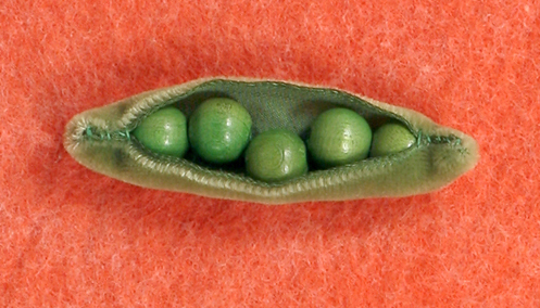
After about 5 years of mass producing the pins, I moved on to other things, including motherhood. Since then, I’ve had several business ventures, which inevitably reach a point when I’ve had to make a decision to grow or stop all together. I’ve always chosen freedom, never wanting to spend all of my time running a business, even though I see the promotional part as an important element of a creative project. And it’s not as if I walked away from a gold mine. At the wholesale price, I was making so little for my time. Being an artist means coming up with new ideas and making the same thing over and over has therapeutic, although limited appeal. Even the idea of hiring others to do the work made me nervous. I knew that I would be a miserable boss, having to hold others to a high standard of workmanship at low pay. And, I realized that I am happiest while making things myself! I have no exact record of how many pins I made, but it must have been well over a thousand. Throughout, the peapod was a best-seller, which was ironic because it was the simplest and fastest to make of all.
To keep up with new posts, please subscribe to this blog. Your contact info will not be sold or shared. If you’d like to see more frequent photos tracking the projects in my studio, please follow me on Facebook and/or Instagram.
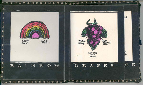
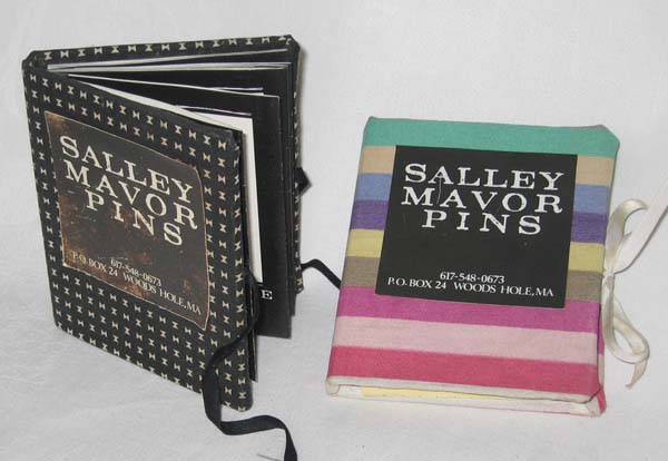
I started adding new designs and soon had 20 different pins. It was time to be more serious about marketing and I decided that a catalog was needed to reach more people. A former classmate from RISD, Niki Bonnett, volunteered to develop some promotional materials for my business.
Pin catalog designed by Niki Bonnett, 1980
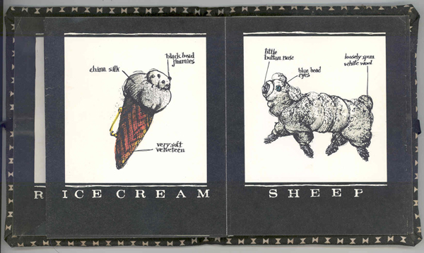
Niki devised a poster that could be cut up in strips and glued together in such a way as to make an accordion-fold catalog. She made drawings, with descriptive hand written notes identifying materials and features of each pin. For the sake of economy, the poster was printed in black and white, and I hand colored the pin illustrations with markers. I constructed a cover for each catalog out of cloth-covered cardboard. Then I glued the beginning and end of the accordion folded pages to the inside of the front and back covers, along with ribbon ties. The finished catalog size was 4″ x 3″.
pin poster designed by Niki Bonnett,1980
In a recent conversation from her home in Ashville, NC, Niki remembers this about the project: “When I did your job, I was working at Hill, Holliday, Connors, Cosmopulos (HHCC), a well-known ad agency in Boston. I was doing freelance work at night to build my portfolio and I loved your pins. For your project, I designed a poster with all the art and type as white on a black background. Once printed, it could be cut up into horizontal strips that were then hand colored, accordion folded, taped together and hand-bound into a fabric wrapped cover (also handmade) that tied shut with a bit of ribbon. Obviously, back then I didn’t think about my time as part of the cost of doing the project, and I had plenty of it back then too! All it cost was the printing of some black and white posters! Those posters looked great on their own, and it was lots of fun making those books; they were little gems.
In addition to the design and production of the piece, I also did all the illustrations of the pins, the calligraphy naming each pin style. I got one of the typesetter reps who visited HHCC every day to give me an entire alphabet of uppercase, metal letters (“slugs”? I forget the terminology for those bits of lead type). The letters were tiny, maybe 12 point. I used a brayer to roll black acrylic paint out on a piece of glass and then hand printed each tiny letter on rough newsprint until I got the “perfect” letter. Once I chose the letters for the entire alphabet, I blew them up to four times the original size on the Photostat machine (Good thing I had a key to that ad agency! Can you imagine being able to sneak back into a large office now to work on your own stuff from 8 to midnight?). That became my typeface from which I made all the “typeset” words. Needless to say, there was A WHOLE LOT of cutting and pasting goin’ on!
House Pin 1977
I was very proud of that project and I know I still have at least one of those books and some pins tucked away somewhere all these years later. I sure do miss the hands-on way design was done before computers; that’s what eventually caused me to quit my graphic design business in favor of making art quilts. I never made the kind of money I made in commercial art with my textile artwork, but it was so enjoyable… the creativity and the “making” of things!”
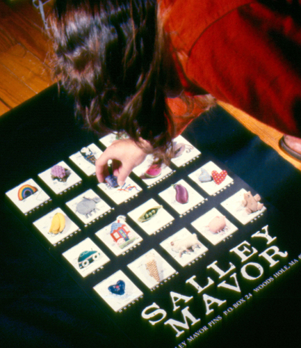
Salley arranging pins on top of poster, designed by Niki Bonnett, 1980
Mummy pin
Eggplant Pin 1977
My pins were included in Yankee’s Feb. 1981 issue, along with articles about a man who played music on a saw and someone who repaired oriental rugs. Laura Gross wrote, “Sparkling beads and soft velvet compliment her intricate hand-sewn and embroidered Egyptian mummies, palm trees, hearts, carrots, etc. Prices range from $4.00 to $12.00, and her custom work starts at $15.00. In the past, Salley has specially made banjos, cats, mermaids, New York town houses, corn-on-the-cob and a doctor’s bag, complete with gold initials.” I don’t recall making the doctor’s bag, but I do remember sewing on individual yellow seed beads for kernels of corn.
pin catalogs, 1980
People wrote in response to the article and I sent out free catalogs in manila envelopes. I can’t remember how many orders came in, but it was enough to keep me busy for a while.
To keep up with new posts, please subscribe to this blog. Your contact info will not be sold or shared. If you’d like to see more frequent photos tracking the projects in my studio, please follow me on Facebook and/or Instagram.
The peapods were the gateway to my life of stitching. I started making peapods and other pins in art school in the 1970s, as a totally separate project from my class assignments. Some of my friends knew about them, but my teachers hadn’t any idea.
One day during class, I was listening to a critique, sewing some peapods, when my teacher, Judy-Sue Goodwin-Sturges, noticed what I was doing. She looked more closely, asked me a few questions and said, “Why don’t you do this kind of thing for your illustrations? Try sewing them.”
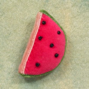
Watermelon pin 1977
Bunch of Grapes Pin 1977
With that simple encouragement, I stopped trying so hard to translate the images in my head through a brush or pen. Given permission to work outside of traditional illustration mediums, I found that I was much happier and energized. I was no longer struggling to keep in step, but, with a needle and thread, I could dance. For some reason, I’d been under the impression that in art school, one does “serious” fine art and I’d kept my interest in sewing and handcrafts underground. I rediscovered the joy of creating and learned to trust my hands and gut feelings to help work out challenges.
After graduation, I added more designs and started mass producing pins and selling them on a wholesale basis to shops. I had to really push myself to call shops and and arrange in-person visits to businesses. I was more content sitting at home, covering little red beads with sheer lavender fabric to make bunches of grapes or sewing strings of green wooden beads inside a velvet ribbon peapod. Despite my shyness about pedaling my wares, I found the marketing part of the business to be a creative exercise. I’d spent my teenaged years working in my mother’s import shop in Woods Hole, From Far Corners, and the experience of dealing with customers and knowing the difference between wholesale and retail was helpful.
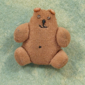
I started making custom pins of people’s cats, based on photographs they sent. I found that Siamese cat owners were particularly fussy about their breed and one time had to redo a blue point. The cat ears are made from a coiled wire bead, which I cut in half.
back of Cat pin
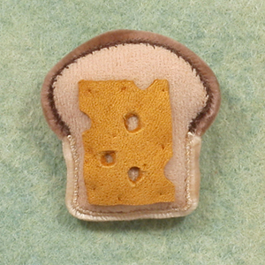
Some of the pins like the cat and the watermelon have a cardboard shape inside to give them stability. I’d sew a little pocket, turn it right side out and slip the cardboard in, put in some stuffing and sew up the pocket.
cardboard patterns for pins
I used my Singer Featherweight, the same machine on which I learned to sew, to do the machine part. There was always a lot of hand sewing to finish and attach the pin back. I had some labels printed with my name and sewed them under the pinback. They were the same kind of labels you get at fabric stores for sewing on children’s camp clothes.
In the studio 1979
This is the first of 3 parts. The story is continued in PINS (part 2).
To keep up with new posts, please subscribe to this blog. Your contact info will not be sold or shared. If you’d like to see more frequent photos tracking the projects in my studio, please follow me on Facebook and/or Instagram.
Maybe it’s because of their warm color and their pointy ears, noses and tails, but I find foxes appealing. This group of foxes starts with a detail from “Laplander”, a tempera painting on brown paper, which I did in art school. Then there’s the tail portion of a wooden toy I made in 1986 and a “faux” tile I painted in my kitchen in the early 90’s. See all of the faux tiles in another post here. Next is a felt purse, which I used to sell as a kit about 10 years ago and then a detail from my 2001 children’s book, In the Heart.
detail from "Laplander", 1976
detail from wooden toy fox, 1986
detail of faux tile, 1993
Fox felt purse kit, 2000
detail from the book, "In the Heart", 2001
Note: See other posts in the Close-ups series archive here.
I saved these 2 books from the ” Big Golden Book” series from our childhood collection. My mother was a fan of Alice and Martin Povenson and we had many of their books. I even met Alice about 20 years ago and told her how influential her and her husband’s work was. The Color Kittens was my first introduction to color theory and Funny Bunny is another early example of their work. In my opinion, they were the best at stylizing animals for children’s books, bringing an elegant sophistication that was lacking in other “cartoony” illustration. You can see more of the Provensen’s work here.
“The Color Kittens” illustrated by Alice and Martin Provensen, 1950’s
illustration from "The Color Kittens"
"Funny Bunny" illustrated by Alice and Martin Provensen, 1950's
This series of moons are all details from some of my children’s book illustrations. The close-ups are from The Way Home, You and Me: Poemsof Friendship, In the Heart, Wee Willie Winkie and Pocketful of Posies and Hey, Diddle, Diddle!.
from “The Way Home” 1991
from “You and Me: Poems of Friendship” 1997
from “In the Heart” 2001
from “Wee Willie Winkie” 2005
from “Pocketful of Posies: A Treasury of Nursery Rhymes” 2010
Note: See other posts in the Close-ups series archive here.